Making the Impossible Possible
“We, along with our consumer base, could not be happier with how this amazing book turned out. the Source went above and beyond to accommodate any sourcing necessary to finished off this vintage inspired skateboard book.”
Southern California skateboard culture has always been more than a little rebellious. So when vintage skateboard enthusiasts and entrepreneurs Stanton Hartsfield and Jason Cohn of Orange County’s Scavenger Brand decided to publish a “coffee table” book documenting the early history of skateboards, they knew that they needed to create something that would transcend the confines of traditional book design. Unimpressed by the standard printing options available, the duo teamed up with
the Source – printing made Easy to challenge the limits of conventional printing technology and create a publication where the exterior form factor would be as much a work of art as the contents within.
For noted skateboard collectors Hartsfield and Cohn, Surf to Skate Volume 1: Evolution to Revolution was a true labor of love. Hartsfield, who has a background in art design, and Cohn, whose personal skateboard collection has appeared in the California Heritage Museum, had very specific ideas on what their homage to the pioneering skateboards of the 1950s and 1960s should look like. Translating their dream concept into reality, however, would require the staff at the Source to do a little creative pioneering of their own.
Making the Impossible Possible
The initial concept seemed simple enough. Hartsfield and Cohn wanted the book to have both the shape and appearance of one of those vintage 1960s skateboards. At nearly 5” tall and 19” wide, the book would, in fact, be as large as some of the original skateboards pictured within.
To keep the appearance as close as possible to a real skateboard, Hartsfield and Cohn wanted the final product to be perfect bound, with the binding being on the shorter edge. And therein lay the first major challenge.
“A book that is 19″ long with a spine of 5″ really isn’t the ideal book for a bindery to sign up for,” explains Hartsfield.
Indeed, the Source contacted several bindery companies in the U.S. and learned that there was no perfect bind machine in the country that could handle that size of book bound on the short side.
Undeterred, the team members at the Source turned to their contacts in Asia. But the answer was the same. There simply was no perfect bind machine up to the task.
It was time to look for creative alternatives. In the hopes of maintaining the perfect bound look, the Source proposed a side staple binding with a wraparound cover to hide the staples. The team produced a mockup and presented it to Hartsfield and Cohn at Scavenger Brand, but the look wasn’t quite right.
the Source considered and rejected other options, such as Chicago screws, as they did not mesh well with the clients’ original design concept.
Finally, they hit upon the idea of rivet binding. the Source produced a new mockup. The clients were intrigued by this new approach, however, the glossy rivets that were readily available seemed a bit out of place in a book about vintage skateboards. And that triggered the next challenge: finding the ideal rivet.
As Hartsfield recalls, “We went back and forth with the guys over at the Source to find the perfect ‘vintage looking’ rivet that could bind the book in two key locations, including a wrap cover.”
After an extensive search, the Source discovered a process wherein an antique finish could be applied to the rivets. The binding issue was solved.
According to Hartsfield and Cohn, the new binding process, “…not only gave the impression of a perfect bind; it also added that extra character to drive sales and interest.”
Still, the project would need to jump over a few more obstacles before the presses were ready to roll.
Skating Past the Final Obstacles
According to the design concept, the book was to be shaped like a skateboard deck. This meant that the pages and cover of the bound book would need to be die cut to obtain that distinctive skateboard shape. Unfortunately, at 152 pages the completed book would be approximately a half inch thick, making it incompatible with standard die cutting processes.
the Source hit upon the idea of using the “cookie cutter” type die employed by envelope convertors. the Source contacted their partners in that industry, and — after several weeks of testing and multiple conference calls with die manufacturers — they were able to confirm that such an approach was possible.
Still, no one had ever attempted a project quite like this one, and while the individual elements had been thoroughly tested, bringing Scavenger Brands’ design concept to life would be the true test of the Source’s problem solving capabilities. On top of that, the print quality would need to complement the high quality photos contained within and the aesthetic appeal of the subject matter.
“The challenge here,” explains Hartsfield, “was to match the unique color and wood texture for each and every board contained in the book.”
So what was the final result?
According to Hartsfield and Cohn, “The outcome was amazing.”
Indeed, the book proved to be an immediate hit.
“Sales have gone through the roof. We are now in stores in Australia, Japan, the UK, Hawaii and of course California!”
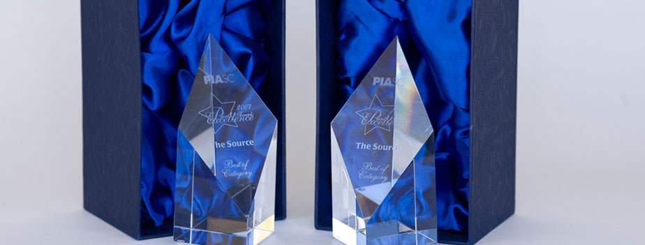
As for the Source – printing made Easy, the “skateboard” book has proven to be one of the most challenging, yet creatively rewarding, projects that the company has ever tackled. This fact was underscored when the project received “Print Excellence” awards from the PIA in both the Art Book and They Said It Couldn’t Be Done categories.
